Accessible Button Colors for Modern UI Design
Buttons are one of the most important places to get color right. Users rely on buttons to submit forms, save work, make purchases, and move through workflows. If button colors are unclear or low contrast, the interface becomes harder to use and less trustworthy.
Start With the Text Contrast
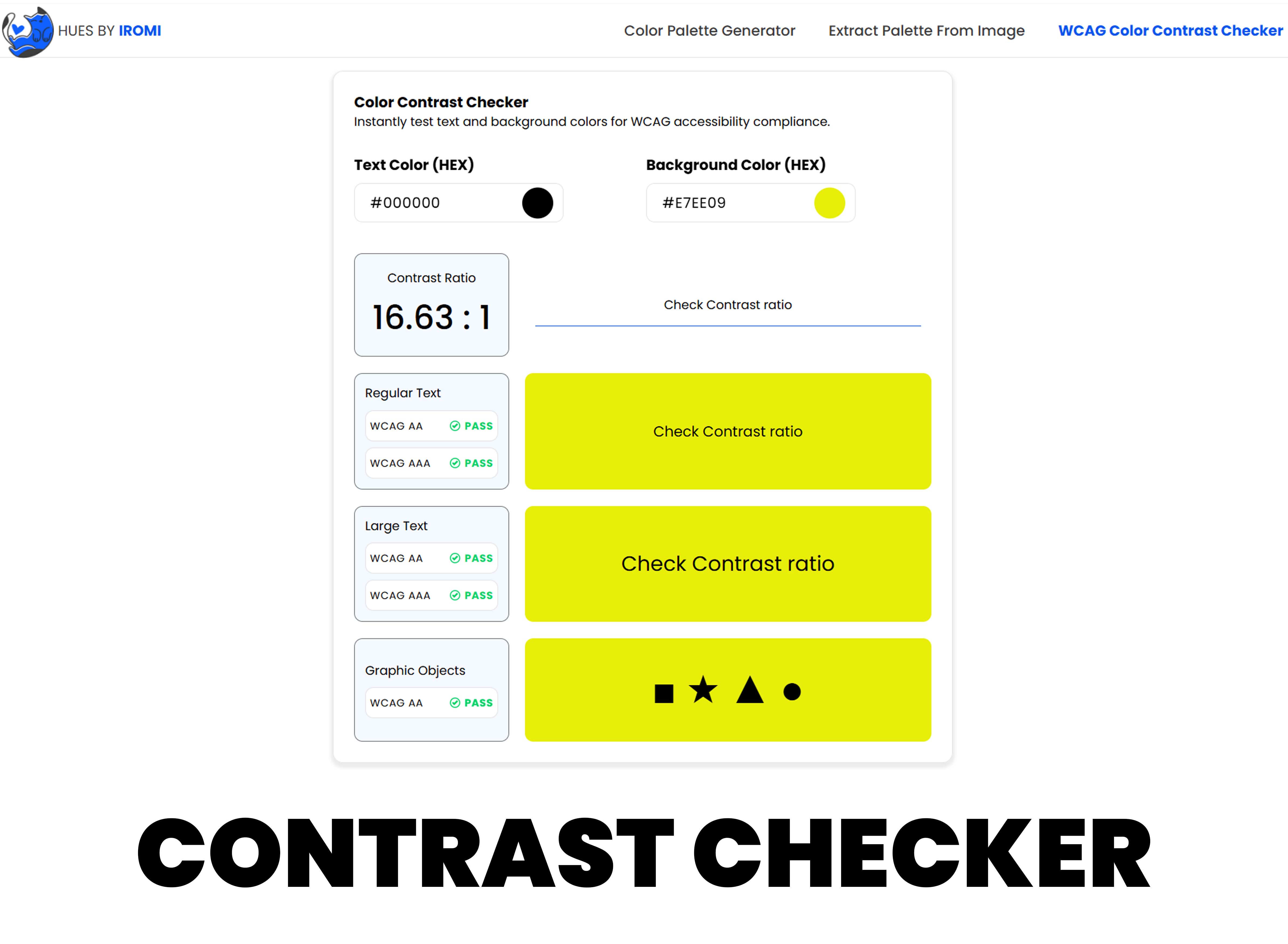
A button color is not complete until the text color is tested against it. White text on a bright yellow button may look energetic but often fails contrast. Dark text on a medium blue may also fail. Test the exact foreground and background pair before using it in production.
Create State Colors Deliberately
Buttons need more than one color. Hover, pressed, disabled, loading, and focus states should all be visible. A common mistake is making hover colors too similar to default colors, which gives users little feedback.
- Default: clear and recognizable
- Hover: slightly stronger or darker
- Pressed: visibly active
- Focus: strong outline or ring
- Disabled: quiet but still understandable
Use One Primary Button Style
Too many strong button colors make a page feel noisy. Most interfaces work better with one primary button color, one secondary button style, and one destructive style for risky actions. This makes the main action easier to identify.
Be Careful With Brand Colors
Brand colors are not always accessible as button backgrounds. If the official brand color fails contrast, create a darker or lighter accessible variant for interface use. The brand identity can remain intact while the product becomes easier to use.
Button Pairing Examples
A dark navy button usually works well with white text because the brightness difference is strong. A pale yellow button often needs dark text instead of white. A bright green button may need a deeper green variant for primary actions. These small adjustments keep the brand feeling consistent while improving readability.
Always test the button in context. A color that passes on a white background may feel too weak on a tinted section, and a focus ring that works on a light page may disappear on a dark card.
Accessible button color is a design quality issue, not just a compliance task. Clear buttons reduce hesitation and help users complete actions with confidence.